Points Payment
Evolving the payment method and process for redeeming gifts and rewards.
Challenge
New requirements, give user more control.
Through a shift in business requirements, we wanted to enhance the the experience of the reward platform. Currently rewards and gifts were given out by team leaders or authorised personnel and to give the end user (individual receiving the reward) we needed to create a new area and way of them redeeming gifts but not seeing the price of the items.
Research & Discovery
The current process relies on the system understanding the cost to be able to order the item and process payment at the end. This was going to be a very technical project as well as needing a solid user experience, so close and frequent contact with engineering was going to be vital.
During some market research and internal technical research we uncovered multiple ways in which the user would be able to purchase products.
Approach
New doors had to be opened.
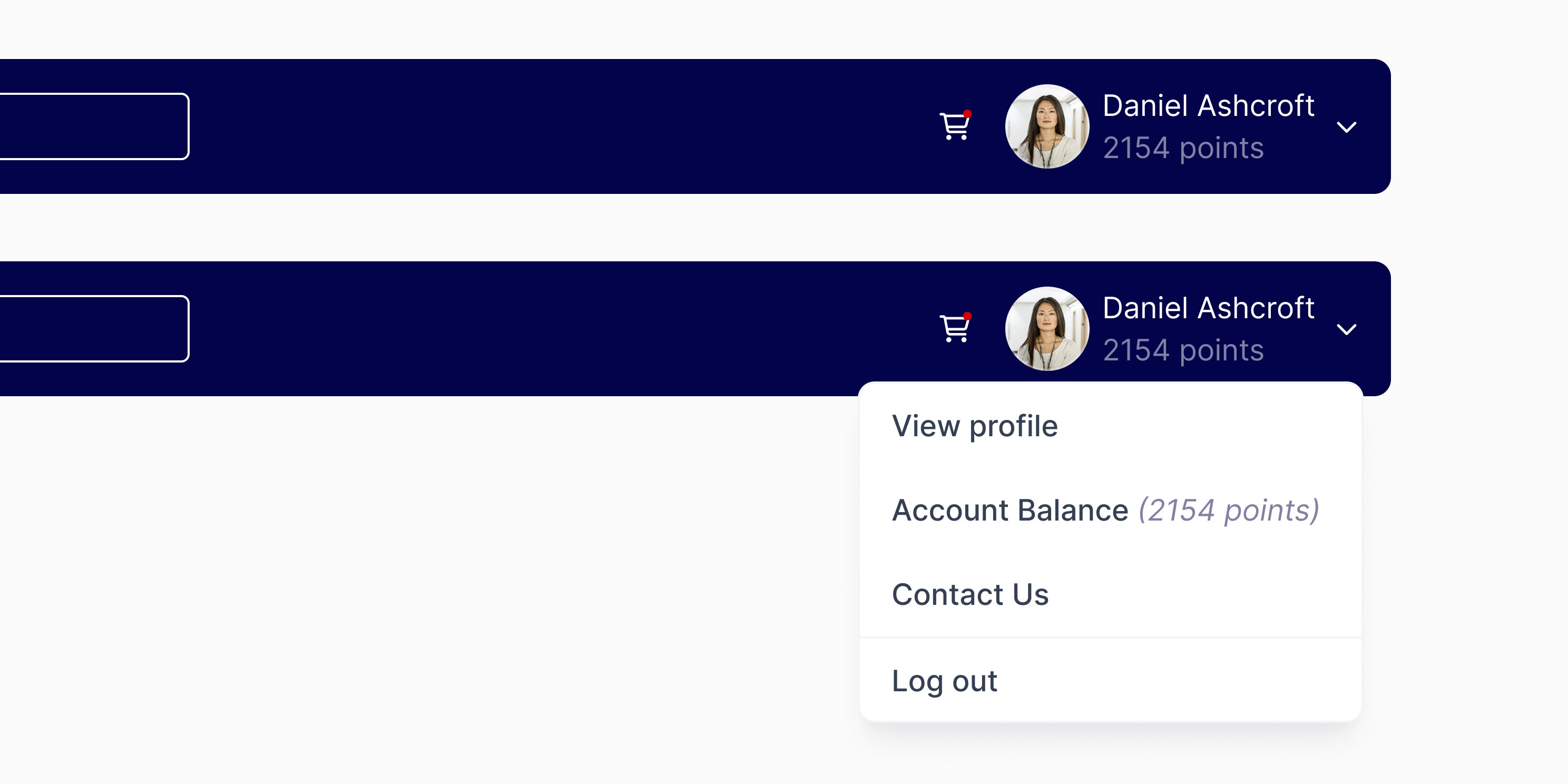
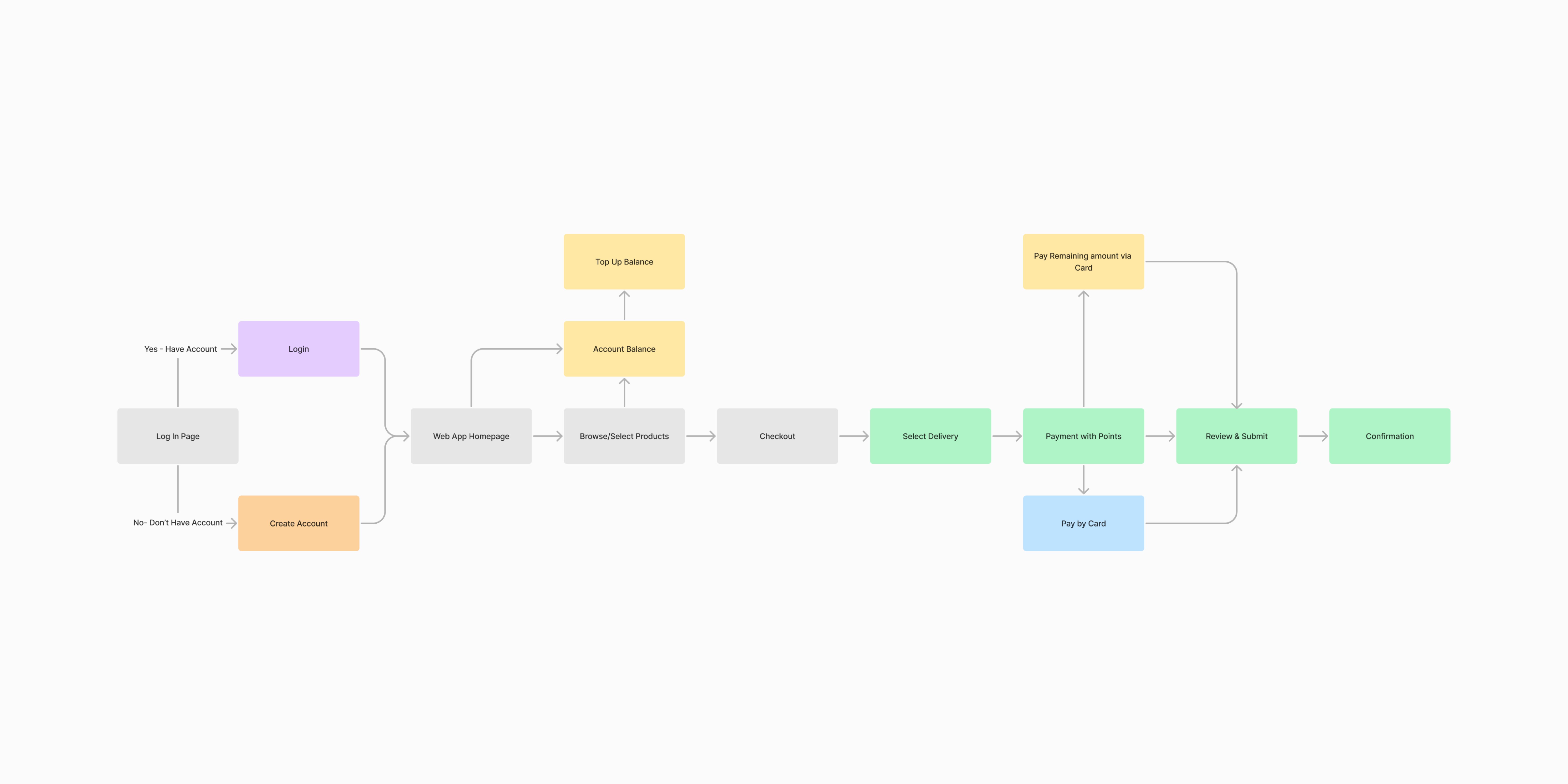
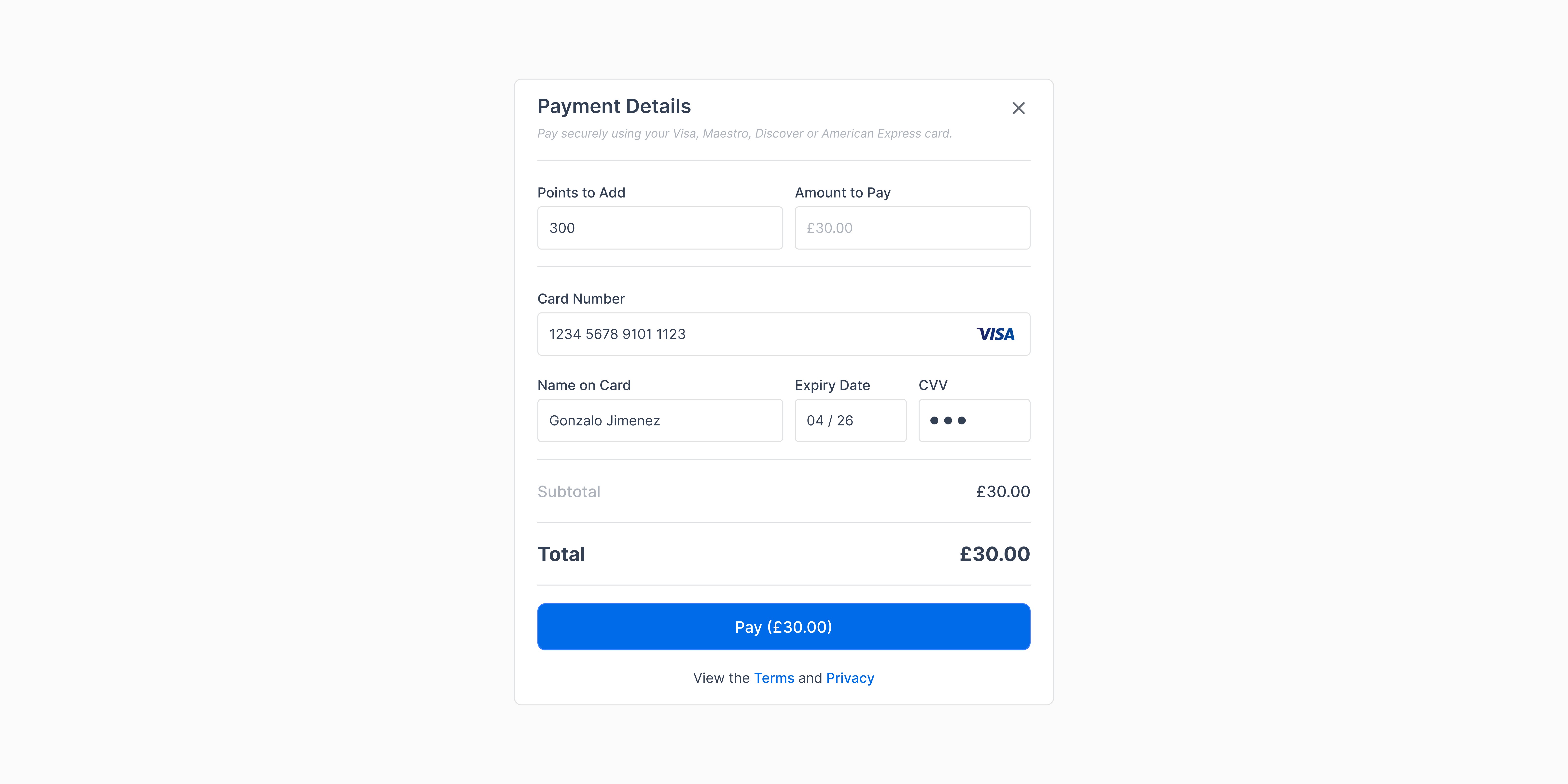
From the research we liaised with engineering to understand what would be possible and also what would be the best option in order to maintain and track. We settled on since we already have accounts for individuals to go on and purchase products, that a second tier of account would need to be created. This account would need to be created by the end user themselves, this would require a form of unique identification code to grant them access. Once on the account they would be able to top up the account with points (instead of actual currency), very similar in to how an e-gift card would work.
User Interface
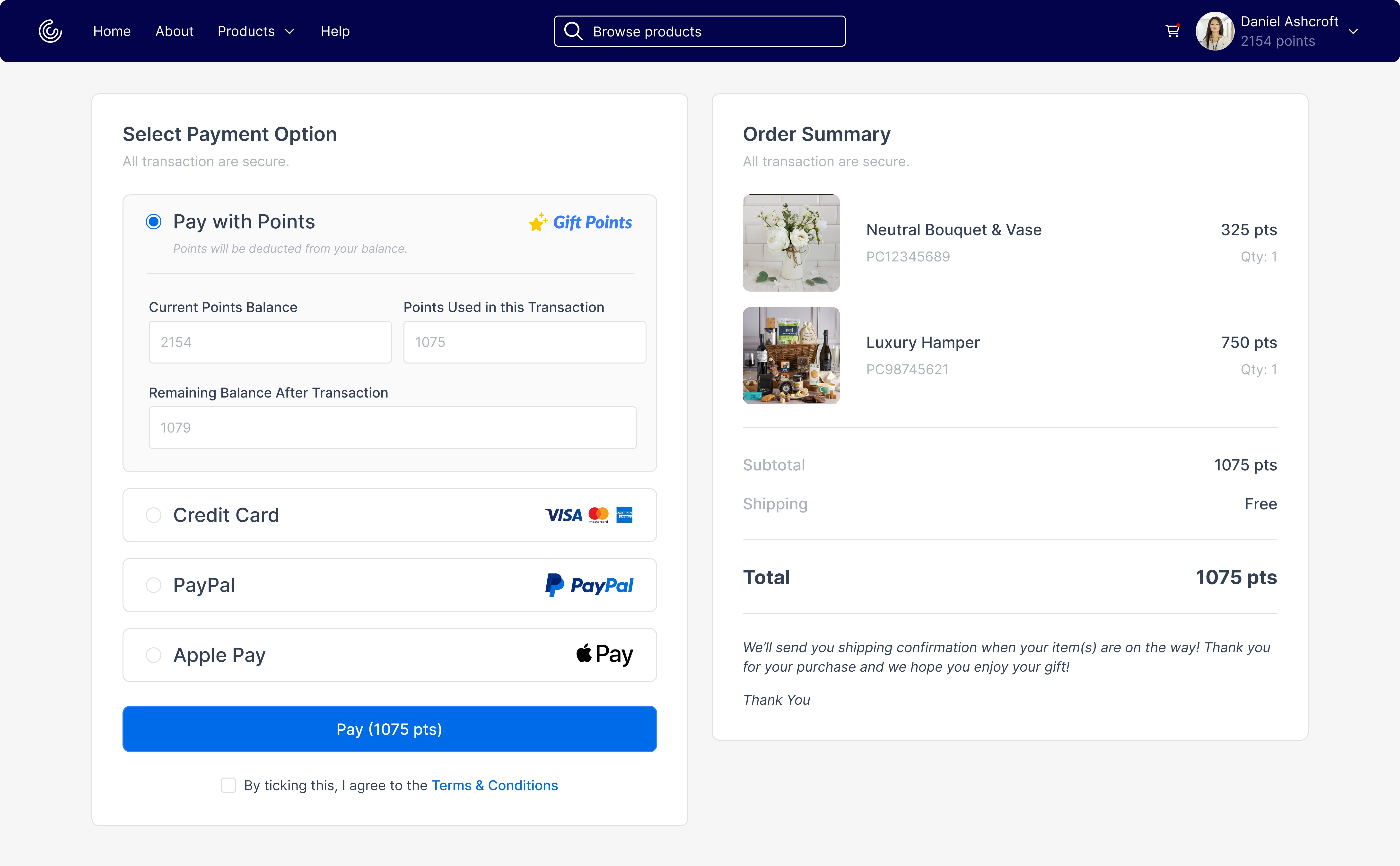
The user interface and flow needed to be similar to how users currently go through buying anything online as to not cause confusion and provide the user with uncertainty. We stuck to a clean and minimal design to be able to adapt the clients branding.
Findings
Increased revenue, increase in customer engagement, increased customer retention.
A new avenue for generating more revenue was created for the business and with the collaboration of engineering and design the internal relationships grew stronger. After launch of the product we received immediate uptake from the current clients, who were encouraged as it saved them time and increased the customer engagement.
A decision was initially made to only show products that the customer could afford with their points, however we noticed a gap were profit could be made. So we then went on to add all products and the ability for the user to add more money to their account so they could purchase things of a higher value if so desired.
Statistics
In one particular client this new feature helped them better engage with their customers and increased their retention rate by 10%.

Points Payment
Evolving the payment method and process for redeeming gifts and rewards.

Challenge
New requirements, give user more control.
Through a shift in business requirements, we wanted to enhance the the experience of the reward platform. Currently rewards and gifts were given out by team leaders or authorised personnel and to give the end user (individual receiving the reward) we needed to create a new area and way of them redeeming gifts but not seeing the price of the items.
Research & Discovery
The current process relies on the system understanding the cost to be able to order the item and process payment at the end. This was going to be a very technical project as well as needing a solid user experience, so close and frequent contact with engineering was going to be vital.
During some market research and internal technical research we uncovered multiple ways in which the user would be able to purchase products.


Approach
New doors had to be opened.
From the research we liaised with engineering to understand what would be possible and also what would be the best option in order to maintain and track. We settled on since we already have accounts for individuals to go on and purchase products, that a second tier of account would need to be created. This account would need to be created by the end user themselves, this would require a form of unique identification code to grant them access. Once on the account they would be able to top up the account with points (instead of actual currency), very similar in to how an e-gift card would work.
User Interface
The user interface and flow needed to be similar to how users currently go through buying anything online as to not cause confusion and provide the user with uncertainty. We stuck to a clean and minimal design to be able to adapt the clients branding.


Findings
Increased revenue, increase in customer engagement, increased customer retention.
A new avenue for generating more revenue was created for the business and with the collaboration of engineering and design the internal relationships grew stronger. After launch of the product we received immediate uptake from the current clients, who were encouraged as it saved them time and increased the customer engagement.
A decision was initially made to only show products that the customer could afford with their points, however we noticed a gap were profit could be made. So we then went on to add all products and the ability for the user to add more money to their account so they could purchase things of a higher value if so desired.
Statistics
In one particular client this new feature helped them better engage with their customers and increased their retention rate by 10%.


Points Payment
Evolving the payment method and process for redeeming gifts and rewards.

Challenge
New requirements, give user more control.
Through a shift in business requirements, we wanted to enhance the the experience of the reward platform. Currently rewards and gifts were given out by team leaders or authorised personnel and to give the end user (individual receiving the reward) we needed to create a new area and way of them redeeming gifts but not seeing the price of the items.
Research & Discovery
The current process relies on the system understanding the cost to be able to order the item and process payment at the end. This was going to be a very technical project as well as needing a solid user experience, so close and frequent contact with engineering was going to be vital.
During some market research and internal technical research we uncovered multiple ways in which the user would be able to purchase products.


Approach
New doors had to be opened.
From the research we liaised with engineering to understand what would be possible and also what would be the best option in order to maintain and track. We settled on since we already have accounts for individuals to go on and purchase products, that a second tier of account would need to be created. This account would need to be created by the end user themselves, this would require a form of unique identification code to grant them access. Once on the account they would be able to top up the account with points (instead of actual currency), very similar in to how an e-gift card would work.
User Interface
The user interface and flow needed to be similar to how users currently go through buying anything online as to not cause confusion and provide the user with uncertainty. We stuck to a clean and minimal design to be able to adapt the clients branding.


Findings
Increased revenue, increase in customer engagement, increased customer retention.
A new avenue for generating more revenue was created for the business and with the collaboration of engineering and design the internal relationships grew stronger. After launch of the product we received immediate uptake from the current clients, who were encouraged as it saved them time and increased the customer engagement.
A decision was initially made to only show products that the customer could afford with their points, however we noticed a gap were profit could be made. So we then went on to add all products and the ability for the user to add more money to their account so they could purchase things of a higher value if so desired.
Statistics
In one particular client this new feature helped them better engage with their customers and increased their retention rate by 10%.
